


For this edit, I have brought down the level of the saturation, to give it an off colour appearance. I used the spot remover to remove any unwanted blemishes. I used the adjustment brush to expose the background to make it look more even. I did try to cut out the bit of hair on the left, but without it, it looked odd, so I left it like how it is now. I also used the adjustment brush to make the card and the models lips stand out more. I increased the red hue to make the red clearer.

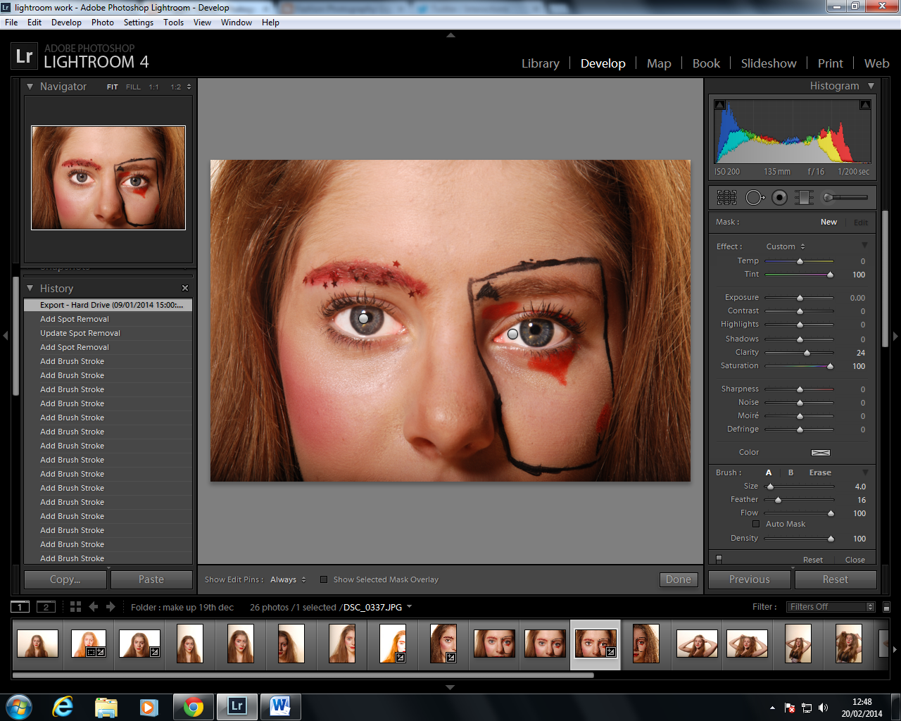
In this photo, the image we have to look at is the one in the top left corner. This was the first edit I did (the photo below/main photo in this screenshot is the second edit). I increased the blue hue to make the makeup stand out better, as it's the main focus of these photos. I then used the adjustment brush to highlight certain areas.


I then experimented with the vibrance, saturation and clarity levels to come up with this final edit. It makes the model look a lot older than she is, but for the effect of the fish, I think it brings a different element to the photo,compared to my other edits.

I cropped this photo so I could get rid of some of the white background that was above her head. I increased the white colours and decreased the shadows. As I'd decreased the shadows amount, I increased, only slightly, the exposure amount. I did this so you could still see where the light was coming from.

I like this edit because the viewer is drawn to the girls eye. I used the adjustment brush to increase the clarity, vibrance and the saturation. Without using the brush, I decreased the vibrance to -26 but increased the saturation to +100. This means the colours are faded but certain parts are still bright.

I like this photo because it is really simple and there is only one main focal point; the lips. I used the adjustment brush to sharpen and increase the amount of saturation. This helps give the lips a brighter and fuller look.

 I increased the vibrance to +100 to enhance the colours of the sequences. I brought down the saturation amount so that the colours weren't too overpowering.
For this edit, i brought down the shadows and blacks amount so we could just focus on her face. I also took down the saturation amount, because most of my edits have a dark blue, and I wanted one that was different. I did this by using the adjustment brush to select areas for enhancing.

I like this edit because I feel like I have made her look more like a fish because her skin is tinted blue. I used the adjustment brush to enhance certain aspects of her face, for example her lips, the eye liner and the sequences on her face. I also used the brush to increase the shadow of her nose. I did this to create a more eerie feel, and also to make the 'Rembrandt' triangle shadow stand out more.
No comments:
Post a Comment