Patrick Demarchelier was born just outside of Paris in 1943 and has lived in America since 1975. His photos can regularly be seen in Vogue, Elle, and Vanity Fair magazine. In 1989 he became the official photographer for Princess Diana of Wales. He has recently taken photos for Zara's Spring/Summer 2014 campaign.


For this photo, Demarchelier would have had the camera set on a fast shutter speed. This would help him to get a clear image of the model as they are moving. This image is rather dark on one side and the outfit is black, the background isn't white, and the lighting is set up so that it isn't capturing the models face. This makes the photo eerie.

The lighting in this photo is set up so that it is coming from behind the model, or on a 90 degree angle, making it a 'split' portrait. As the models face is slightly more in the shadow, we can tell that this is a fashion photo. The dress is the main element in the image as it is big and bright. Having the lighting positioned the way it is enhances the features of the dress. It shows all the little fluffy bits that stick out.
Ward Ivan Rafik:
Ward Ivan Rafik is a Paris based fashion photographer. After graduating from university with a degree in sciences, he decided to move to Paris where he studied photography. He then worked for various major photographers before working for Peter Lindbergh as his first assistant. After traveling around the world with him for 4 years, he decided to move forward on his own.

The top of the models head has been cut out, but that reflects most of the photographs on the Zara website. I don't really like the facial expression of the model and I think that if you are trying to get people to buy clothes, I don't think they should have expressions like hers (she looks in pain). I do like, however, that she is positioned slightly to the right of the image, which makes it more interesting to look at.
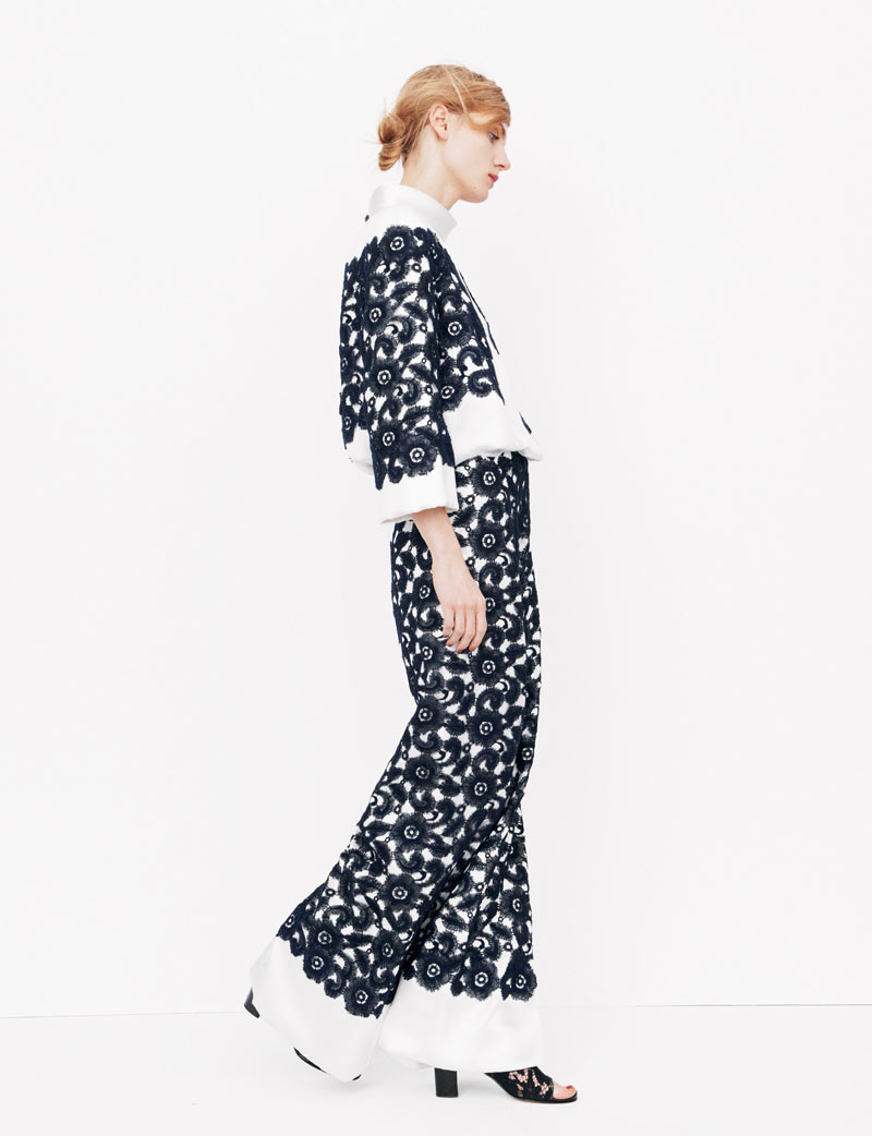
This full length portrait shows a good fashion photo. Although the background is white, and so is part of the outfit, the dark blue of the rest of the outfit make up for the white that is lost to the background. The model is side on which allows the audience to see what they would be buying if they wanted to wear it. The positioning of the model is casual, but her face looks bored.

Anna Bauer:
Anna Bauer is a New York based German photographer. She took some of the photos for the Zara 2013 collection. Some of her photos are shown below.

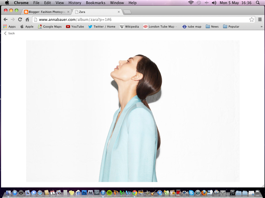

This is a photo for promoting both the top and the skirt, as it is more of a full length image. Again the model is standing casually. The fact that she is off center makes the image more appealing as our eyes are drawn to the idea of it being a bit more interesting. The background isn't completely exposed, which is a good thing because the model is wearing a white top, and she may have blended in with the background if it was fully white.
David Bailey:David Bailey is a well known British photographer. Bailey has made a large contribution to the world of photography, creating imaginative portraits. As a class we visited his Stardust exhibition at the Nation Portrait Gallery on Thursday 10th April. The exhibition includes over 250 images of various people, including actors, writers, filmmakers, musicians, models and people Bailey has met on his travels. Some rooms of the exhibition are devoted to his time in certain countries; Africa, Australia, Delhi and Papua New Guinea. The photos below are from the exhibition.


This photo was taken in 2001 by Bailey of his son Sasha. I like how the image shows the arrow pointing one direction, yet Sasha is looking in the opposite direction. The contrast there makes the image interesting as it is going against what the arrow says to do. The look on the boys face is almost creepy because the photo is in black and white, and so it is harder to make out the boys eyes, and from a distance his eyes look white. The positioning of Sasha is an interesting one, because he is not directly in the middle, yet he isn't at the very edge of the image either. This gives the photo more dynamics visually.

No comments:
Post a Comment